
Mom In Balance
brand book

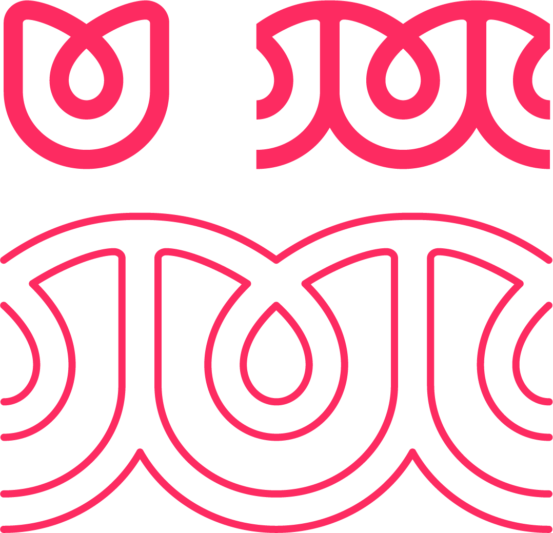
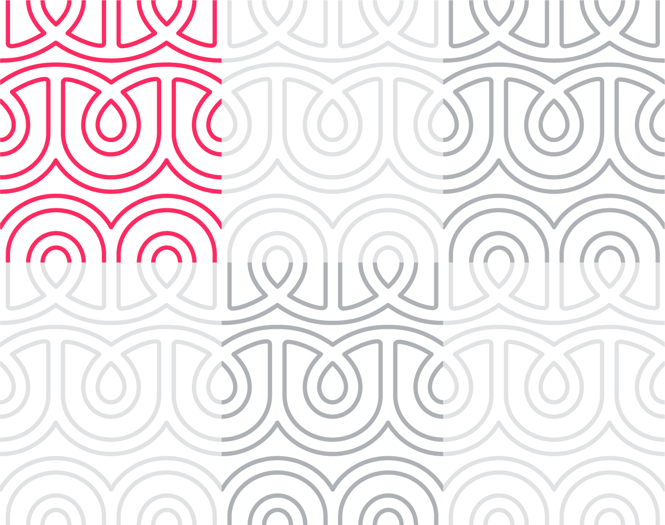
A clear brand book contributes to a visible and recognizable Mom In Balance. Within this brand book there are several characteristics that determine the visual identity: logo, typography, use of color, graphic elements, photography and use of language. This manual shows the building blocks that can be used to create resources.

Questions?

This brandbook is developed by ZUID Creatives. Any questions about the brandbook? Please contact us via info@zuid.com or call 013-545 03 23.

The Mom In Balance logo

Symbol only

The symbol is an important and characteristic element of Mom In Balance. It can be used as a style element, as long as it’s not combined with the main logo in the same layout.

The symbol is an important and characteristic element of Mom In Balance. This can be used in full form on its own as a style element, as long as it’s not together with the main logo (‘Mom In Balance + symbol above) in one layout. However, the symbol may be combined with the entire logo as a style element when it’s cropped or in pattern! See style elements en layout exmples.

Symbol in color (magenta), on white or light background.

Symbol in white, on colored or dark background (diapositive).

Margins

Make sure there is enough space around the logo. Never put text too close to the logo. There is a minimum margin based on the font height of ‘Mom In Balance’.

Don’t distort or rotate

For the purpose of recognisability, the logo or symbol may not be deformed. Colors must also be preserved. Don’t flip, mirror, rotate, etc. or adjust proportions.

Typography

Lovelo Black

To be used in standard headings, left aligned. Centered as activating heading (in combination with Lovelo Line).

Line height = font size x 1.1

Lovelo Line Light

To be used in activating headings. In combination with Lovelo Black, see tab ‘activating headings’.

Line height= font size x 0.9

Lovelo Line Bold

To be used in activating headings. Only when the Line Light is not legible.

Line height = font size x 0.9

Lovelo is a free to use font of Fontfabric

For a striking and characteristic heading, typography may be playfully used by combining the line variant with the solid black variant. For a nice balance, the text in line variant is used larger than the solid black variant. And the text with line variant may be used in color, the black variant in dark gray.

Lovelo Black + Line Light

Lovelo Black + Line Bold

Het is afhankelijk van de boodschap en woorden om te bepalen hoe deze met bovengenoemde mogelijkheden vormgegeven wordt. Bij voorkeur zijn deze koppen kort en krachtig.

Light vs. Bold

De Line Light versie heeft doorgaans de voorkeur. Maar wanneer deze mogelijk lastiger leesbaar wordt kan gekozen worden voor de Line Bold versie. (bij diapositief gebruik op toepassing over beeld bijvoorbeeld). Afhankelijk van de leesbaarheid kan in de Line variant gekozen worden voor de Light of Bold versie.

Montserrat

To be used in body text. Montserrat is available as an extensive font family, from thin to black. Preferably use the light version for body texts. The bold variant can be used for subheadings and accents.

Line height = at least font size x 1.4

For short texts or introductions, the line spacing may be increased to keep the layout clear and clean. A clean layout is needed to keep it looking fresh.

Montserrat is a Google font

Montserrat Light

Montserrat Bold

Verdana

Can be used as an alternative, in correspondence where standard fonts must be used.

Colors

Primary + Functional Magenta

Primary base color for Mom In Balance in general. And the functional color for each workout as well, that all have their own primary color.

HEX: #FD2B61
RGB: R 253 / G 43 / B 97

CMYK: C 0 / M 90 / Y 40 / K 0

Primary Gray

Neutral base color for Mom In Balance in general, for general use in texts etc. (instead of standard black).

HEX: #343D49
RGB: R 52 / G 61 / B 73

CMYK: C 79 / M 63 / Y 48 / K 49

Functional Turquoise

The functional color for Mom In Balance in general and also the primary color for the Pregnant workouts.

HEX: #32c8c3
RGB: R 50 / G 200 / B 195

CMYK: C 66 / M 0 / Y 31 / K 0

Pregnant Turquoise

The primary color for Pregnant workouts

HEX: #32c8c3
RGB: R 50 / G 200 / B 195

CMYK: C 66 / M 0 / Y 31 / K 0

Back In Shape Yellow

The primary color for Back In Shape workouts.

HEX: #FFAF3C
RGB: R 255 / G 175 / B 60

CMYK: C 0 / M 38 / Y 80 / K 0

Mpower Turqoise

The primary color for Mpower workouts

HEX: #007E97
RGB: R 0 / G 126 / B 151

CMYK: C 100 / M 11 / Y 28 / K 20

MpowerNext Purple

The primary color for MpowerNext workouts

HEX: #5f417f
RGB: R 95 / G 65 / B 127

CMYK: C 76 / M 87 / Y 19 / K 6

Styling elements

Graphic elements for a characteristic layout.

The strength of the logo is reinforced by scaling the symbol up large and cropping it. This creates a no-nonsense, visually striking and recognizable style that can be used in many different ways.

Check out the other tabs for additional options regarding the logo.

A pattern has been created with the logo as a starting point. This pattern also acts as a characteristic graphic style element, one that symbolizes connection and increases the feeling of a community.

The pattern should be applied subtly and for that purpose it also must be used as outlines. So it remains light and results as a bright graphic element.

Cropped pattern

The pattern should always be cropped in a plane (frame)as a cut-out of a larger whole. Thus the total layout remains tight and calm.

For applied examples, see, see layout examples

The use of round shapes contributes to the visual identity of Mom In Balance. Think of rounded corners in photos and surfaces, rounded lines and other details.

The logo is shown in white on a colored label, in a shape based on the logo. It should be applied next to the border, so it functions as a label / tab in the layout. The label can be used in the brand identity colors.

For applied examples, see layout examples

The logo should be applied playfully by dropping it partly behind and in front of a photo, in order to create  a paperclip effect.

Photography

Guidelines for matching images.

  • Feminine and sporty with a bit of fun and playfulness.
  • Confident women. Real and  plausible.
  • Spontaneous, in the moment and credible. Not too “staged”.
  • Try to work with extra dynamics. For example by adding movement, playing with depth of field, exciting cut-outs or perspective / angles and a good mix between close and overview.
  • Fresh, bright colors with a warm touch.
  • No obvious image editing, color overlays or filters, etc.
  • Provide diversity by varying portraits, details and overview photos.

The visual language can be somewhat categorized per workout:

  • Pregnant: somewhat lighter, softer shades, relatively higher fun factor. Community feeling.
  • Back In Shape: unburdened, feel-good, comfortable. Confident and playful photography.
  • Mpower: a bit more sturdy, cooler images. Clearly fit and confident. For a powerful appearance.